Tuesday, March 5, 2013

Box and Whisker

Box Plots:

  -These are generally used by teachers to show grades.
  1.   List out all of the data in order.
  2. Find the median of the data and label this Q2 for quadrant two.
  3. Next find the median of both sides of data from Q2.
  4. Label one side Q1 and the other Q3
  5. The highest and smallest points will be set outside to create the whiskers.
  6. If there are any outliers put an astric next to it.


Mean, Median, & Mode

Mean:

  -Is the number commonly used to characterize a set of data.  It is also frequently called the average.  To find the mean of a number you add up all of the numbers and divide by how many numbers there are.

Example: 2,3,3,4,6,7,7,8,9
-add 2+3+3+4+6+7+7+8+9=49
   -49 divided by 9; equals 5.4
*5.4 is the mean!!

Median:

  -Is the value exactly in the middle of an ordered set.
  1. Arrange the numbers in order from least to greatest.
  2. a. If n is odd, it is the middle number
          b. If n is even, it is the mean of the 2 middle numbers.

Example: 2,3,3,4,6,7,7,8,9
  -6 is the median because it is directly in the middle

Mode:

   -The set of data that has the most frequency.  It has nothing to do with the central tendency.

Example: 2,3,3,4,6,7,7,8,9
   -both 3 & 7 are the mode becasue they both occur twice

Mean, Median, Mode website!
http://www.regentsprep.org/Regents/math/ALGEBRA/AD2/measure.htm
 

Line Graphs and Scatterplots

Line Graphs:

  -shows the trend of a variable over time; the values change overtime.
       *time is marked on the x-axis; the variable is on the y-axis


Scatterplots:

  -Show the relationship between two sets of data.  These are used to make predictions
 
 
-They can have a positive correlation. This mean that the trend moves up like the one below:


-They can also have a negative correlation.  This means that the trend moves down.
 
-Or there can be no correlation.  With no correlation a trend line cannot be put in.  A trend line is a line put in to help show the correlation.
 

Histograms, Bar Graphs, & Circle Graphs

Histograms:

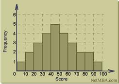
    -A lot like bar graphs but the main difference is that they MUST have order.
*Give the graph a title and label the x & y axis
    -Pictures of Histograms:


Bar Graphs:

*Order does not matter!!!
 
Math is Fun!! -Bar graph website


Circle Graphs:

  -These represent categorical data and also part of a whole.
 
  1. The first step is to lay out all of the information on a dot plot
  2. Find the decimal of each number out of the whole.
  3. convert the decimals into percents.
  4. Multiply the decimals by 360 to find out how big to make the portion of the graph.
  5. Make sure to have protactor and a ruler!!


Pictographs, Dot Plots, & Stem and Leaf

Pictograph:

    -Used to represent tallies of catergories. A symbol or an icon is used to represent a quantity of        items.  A legend is used to tell what a symbol represents.

Pictograph pictures and lessons

Dot Plots (Line Plot):

    -Provides quick and easy way of organizing data.
  • Outlier: number on a dot plot that is far from the others
  • Cluster: isolated group of points
  • Gap: a large space between data points
  • Mode: the data value that occurs most often


Stem and Leaf Plots:

    -A number line that is usually vertical, with digits that are used to represent data.  It is easily created by hand.
 
 
For example if a teacher had a list of numbers they could be placed in the plot like they are below.


Getting Started with Graphs

Definition: A graph is a picture that displays data used to tell a story.
-there are a number of different graphs that can be used for different reasons and data.

In order to create a graph there needs to be data that can be recorded.
Two types of data:
Categorical Data: Data that represents characteristics of object or individuals in groups such as black and white, inside and outside.
Numerical Data: Data collected on numerical variables such as difference in distance a girl and boy can jump.  Distance is numerical variable and colleted data is numerical.